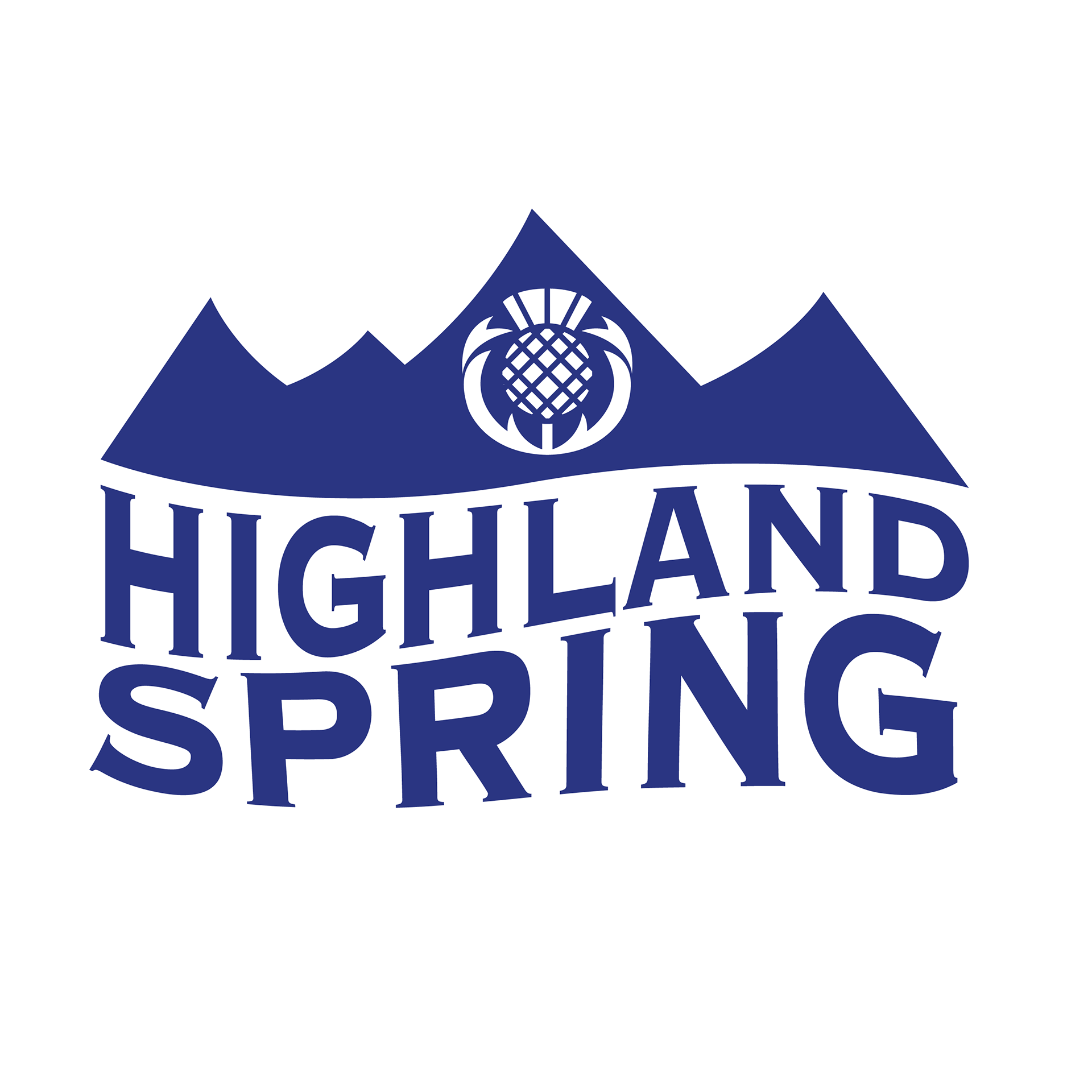
Branding
Highland Spring comes from the majestic Ochil Hills, where it is carefully drawn from protected land. They keep the land free from any pollution, pesticides or habitation to ensure the water we draw is as pure as can be.
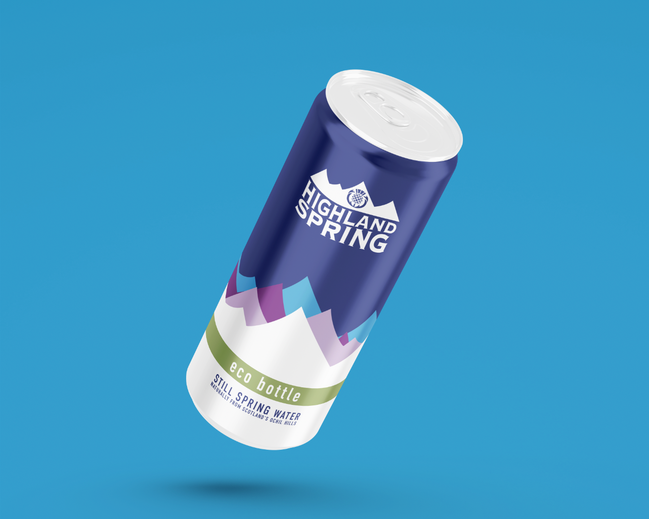
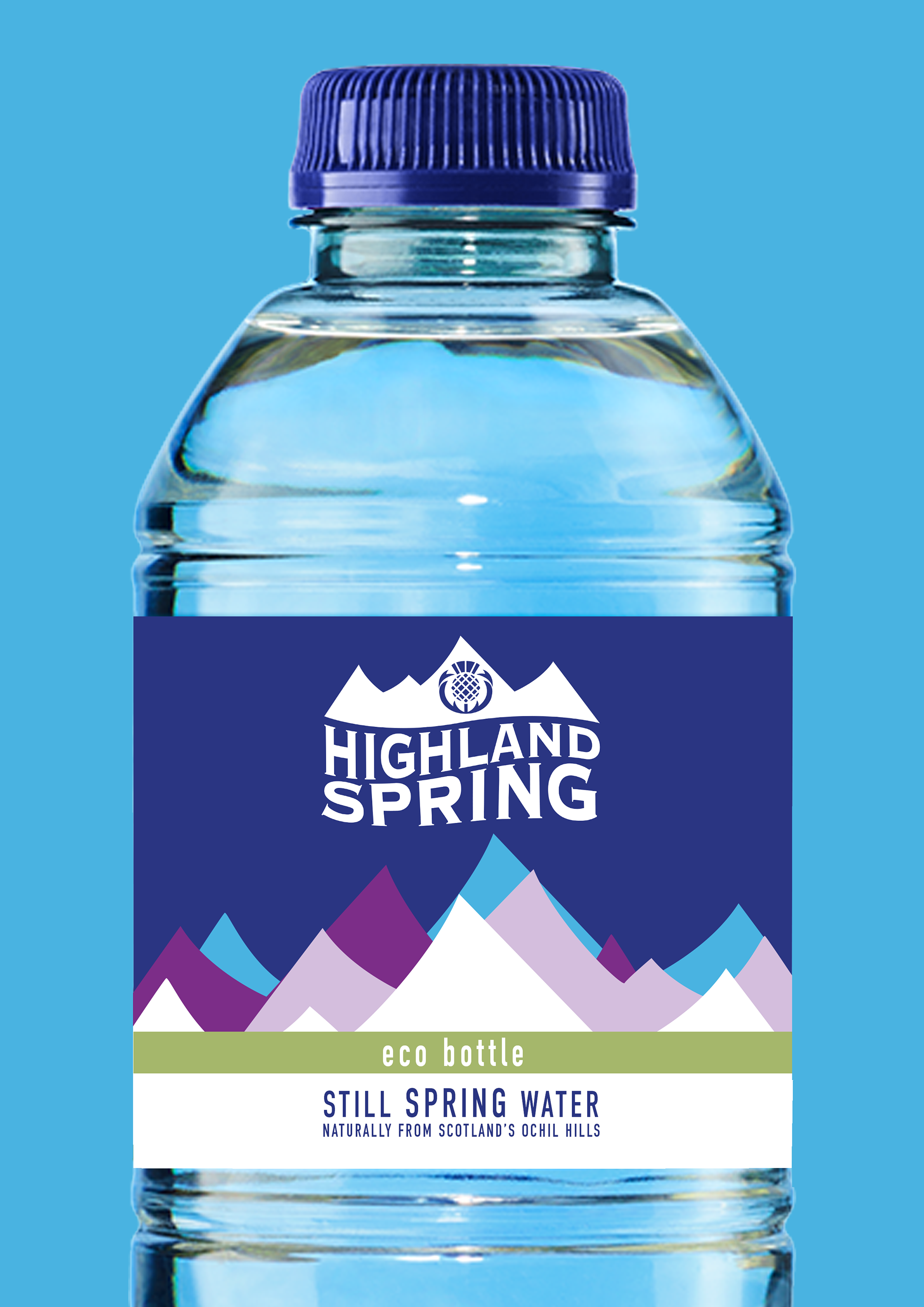
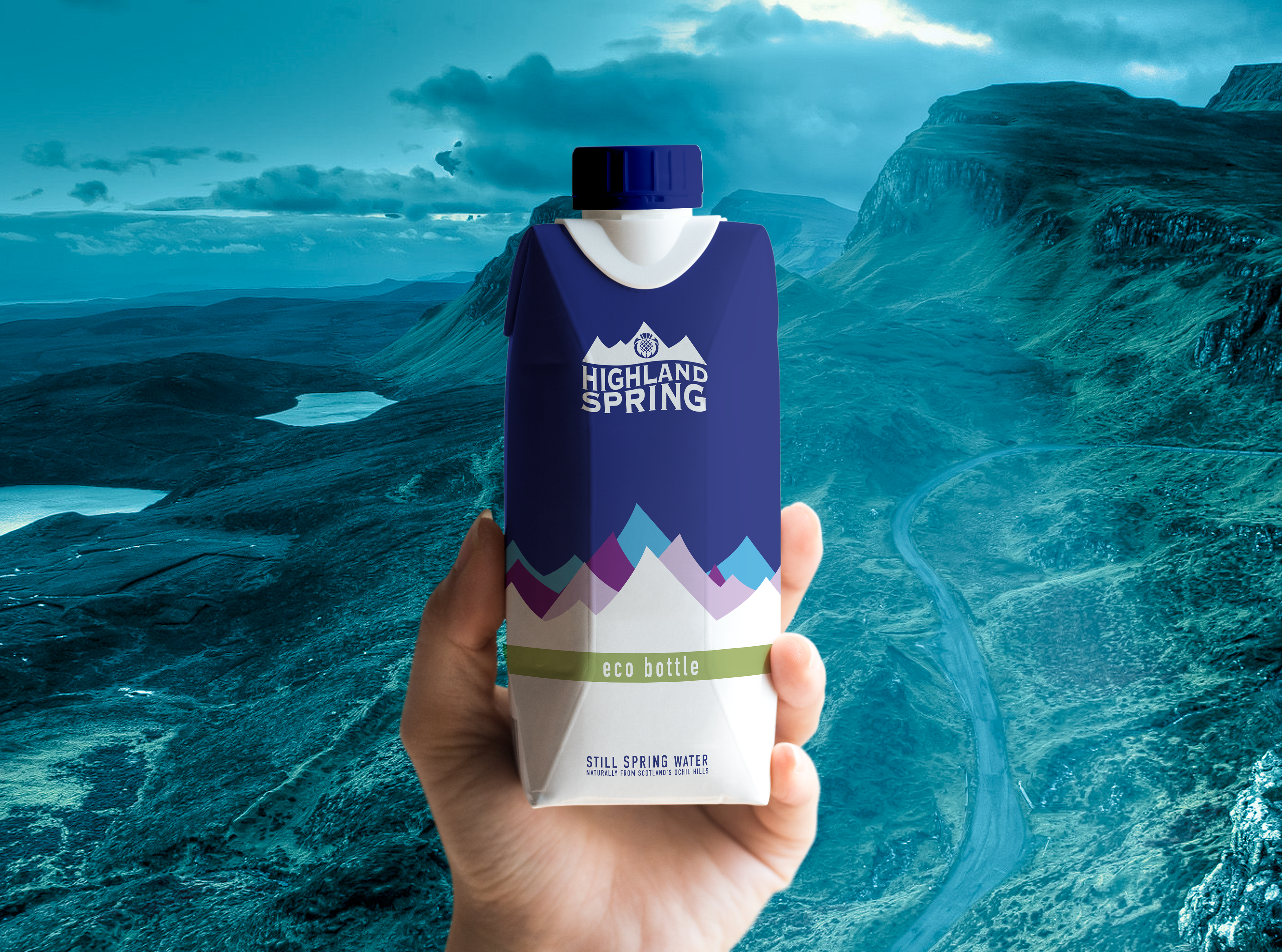
I decided to rebrand Scotland's most well-known water brand to aim towards a younger demographic to promote health and well-being to the world's youth. I also wanted to create a more modern type of packaging to drink water and promote more eco-friendly options.
I began by redesigning the logo simplifying the shapes to make them more geometric and bolder. I also added hills to the logo to represent Highland Spring's origins. The wordmark 'Highland Spring' follows the same path as this represents the water and how each part is connected. I then recreated the thistle and made it centred similar to the old logo but with a geometric style that fits the rest of the logo.
For package design, I kept it similar to the old packaging but reused the logo's hills repeating them with the bold colours of Highland Spring. This can also represent moving water showing the connection of them both again.